Packaging is far more than a container for a product; your product packaging subtly communicates with your customers. It creates first impressions, evokes emotional connections, and drives purchasing decisions. Among its many design elements, color is one of the most powerful tools in influencing consumer behavior.
Understanding color psychology is essential for brands looking to create impactful packaging that resonates with their target audience. Explore the role of color psychology in packaging design to learn how to craft designs that attract attention, build trust, convey value, and enhance recognition.
Psychological Effects of Colors in Packaging
Colors impact consumers on the conscious and subconscious levels, making them an invaluable tool in packaging design. Each color triggers specific psychological responses, which can influence how the audience perceives a brand and how the brand positions its products in the market. Here are some examples of emotional and psychological connections tied to various colors.
Red: Energy and Urgency
Red is a color that naturally grabs attention. It’s associated with excitement, energy, and urgency, often used to stimulate quick decisions or convey a sense of importance. Red packaging is a popular choice for sales promotions, clearance events, or calls-to-action.
Beyond urgency, red can also evoke passion and boldness, making it a strong choice for action-oriented brands looking to stand out or create an emotional connection.
Blue: Trust and Security
Blue is a calming and reassuring color that conveys trust, security, and stability. The finance, technology, and health care industries often lean on this color to instill confidence and reliability.
Blue also has a soothing quality, making it a favorite for brands seeking to create a feeling of peace and dependability in their audience. Blue communicates professionalism and calm authority, whether it’s a bank, an insurance company, or a wellness app.
Green: Nature and Health
Green is a versatile color that represents nature, health, and even prosperity or wealth. Its connection to the natural world makes it an obvious choice for eco-friendly and sustainable brands, as it immediately signals growth, balance, and renewal.
Wellness and health-focused companies also frequently use green to emphasize the importance of vitality and holistic living. Moreover, green’s association with wealth and abundance is also a consideration for the finance and agriculture industries.
Yellow: Optimism and Caution
Yellow is the color of sunshine and happiness, and is often linked to optimism, cheerfulness, and positivity. It’s great for brands that want to appear approachable, joyful, and welcoming.
However, yellow can also signal caution when used in certain shades thanks to its association with warning signs. Brands should use yellow sparingly to add a sense of energy and warmth without overwhelming the audience.
Black: Luxury and Sophistication
Black exudes luxury, sophistication, and elegance, making it a staple for high-end or premium products. It’s the go-to color for brands that want to convey exclusivity, authority, and a touch of mystery.
Fashion, beauty, automotive, and luxury goods often use black to create a sleek, timeless aesthetic that appeals to those seeking refinement and class. Black is also versatile, often paired with other colors, such as gold or white, to enhance its premium feel.
White: Purity and Simplicity
White symbolizes purity, cleanliness, and simplicity, making it a favorite for minimalist designs. Health care, skincare, or technology brands often use white to communicate clarity, freshness, and efficiency. White creates a sense of space and lightness, which helps brands appear more modern and straightforward.
White can also create a sense of balance when paired with other colors, highlighting key design elements while maintaining an overall clean aesthetic.
Cultural Differences in Color Perception
While colors carry universal associations, cultural differences can significantly influence how we perceive them. For example, white symbolizes purity and simplicity in Western cultures, which is why these cultures often use it for bridal gowns.
Conversely, white is associated with mourning and funerals in some Eastern cultures. Similarly, red may signify good luck and celebration in China, while evoking urgency or danger in North American branding.
Brands must consider these cultural nuances when designing packaging for global markets. Failing to account for these differences can lead to misinterpretations and create barriers with consumers in specific regions. Researching cultural preferences and tailoring packaging designs to suit local audiences ensures the product remains relevant and appealing worldwide.
How Color Affects Consumer Behavior
Colored packaging plays a role in shaping consumer behavior throughout the buying process. One of its primary functions is to attract attention on crowded shelves or screens. Bold and contrasting colors help packaging stand out, increasing the likelihood of capturing consumer interest.
Furthermore, consistent color use across packaging and branding enhances brand recognition. Iconic shades, such as Coca-Cola’s vibrant red or Tiffany & Co.’s signature blue, are among the most recognizable and beloved elements of these brands.
Additionally, color influences perceptions of product value. For instance, many associate navy, gold, and similar dark colors with high-end products, encouraging consumers to view the items as luxurious and worth a premium price. Effective use of color, therefore, captures attention and deepens consumer understanding and connection to the brand.
Practical Tips for Using Color in Packaging Design
Selecting the right colors for packaging starts with knowing your audience. Demographics such as age, gender, and region play a big role in color preferences. For instance, younger audiences often prefer vibrant, trendy shades, while older consumers may lean toward classic, muted tones.
Differentiate Through Competitor Research
Analyzing competitors’ packaging is essential for standing out. Look at the color schemes of similar products to find gaps where your brand can shine creatively. Testing different color combinations and gathering consumer feedback ensures your design will be visually and emotionally impactful.
Align With Your Brand Identity
Consistency with your brand identity is key to building recognition and trust. For example, sustainable brands can use greens and earthy tones to reinforce their message.
Go Beyond Color
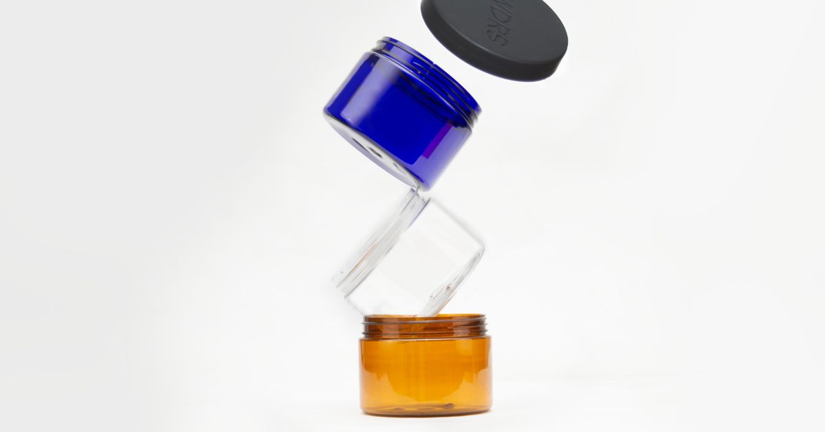
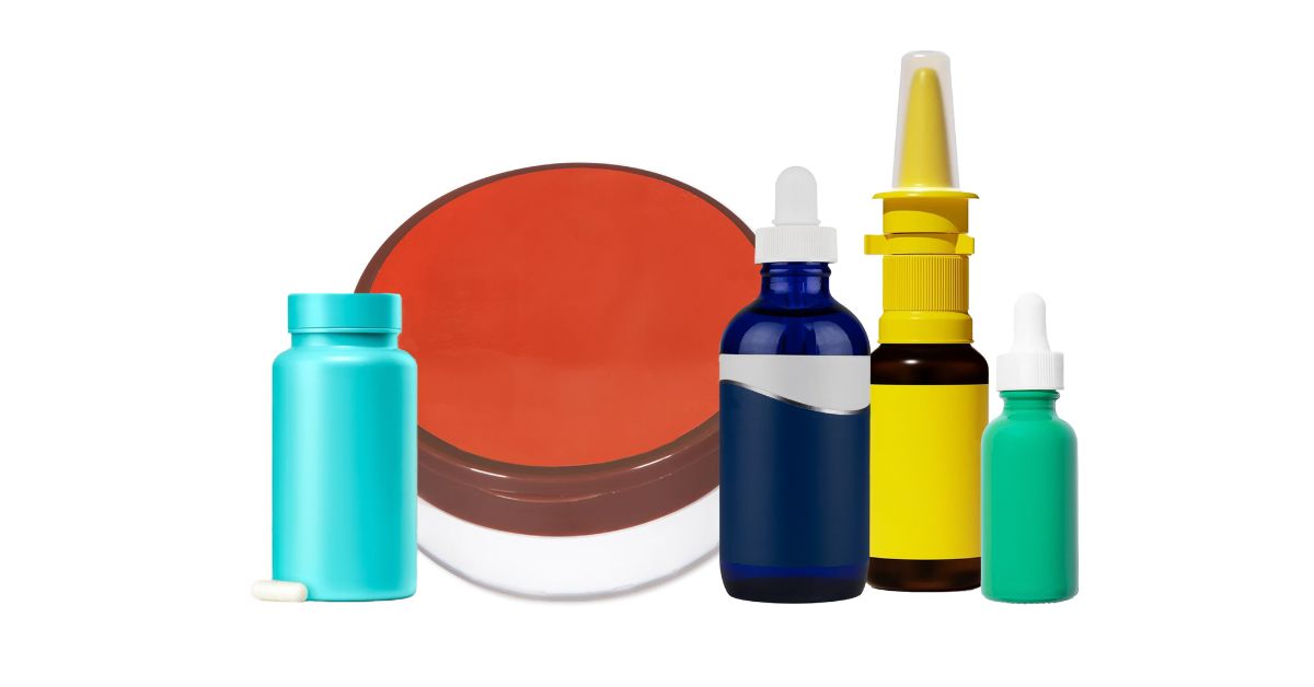
While choosing the right color is important, consider other packaging elements, such as closures and textures, to create a cohesive design. You’ll find a selection of colorful plastic and glass bottles, along with wholesale dropper pipettes and other closures at FH Packaging to complement your brand’s visual identity.
Elevate Your Brand With Strategic Use of Color
The role of color psychology in packaging design is decisive, from shaping first impressions to influencing purchasing behavior. Leveraging the psychology of color allows brands to emotionally connect with their audience, communicate their values, and create lasting impressions. Businesses can set themselves apart in competitive markets by carefully selecting colors that align with their target audience, cultural context, and brand identity.
FH Packaging has the solutions you need if your brand is ready to enhance its packaging game. Explore our range of colorful glass and plastic packaging with precise closures to match your product and brand goals.